Guest Post: Anchanto’s Rebrand, CMO Charles Py

October, 2022 | Staff
We were fortunate to be selected by Anchanto to support them in a significant rebrand. When the project was done, Anchanto’s CMO Charles Py wrote a long, thoughtful LinkedIn post on the rebrand which he kindly agreed to let us repost here.
Rebranding is not a spur-of-the-moment affair, it’s a significant step that impacts a business and all associated with it.
The brand of a company is obviously not just colors, shapes, and a logo. It’s a banner behind which employees, customers, and partners can rally. It’s a sentiment, a connection we create with the company we work with. A brand also has a purpose. A brand has a job to do*.
Hence, a rebranding project must be done strategically, to empower and emphasize its relevance.
As we celebrate the new Anchanto, I wanted to share more details about how we got here without losing sight of these principles. This project is a complete transformation beyond our logo and website which communicates the depths of our vision, innovations, and refined value.
More importantly, it’s a step toward growth for us and for our users.
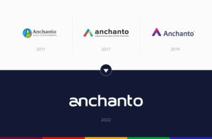
The Thoughts Behind Our Rebranding And New Look
You may ask, what breakthroughs caused us to refresh our look, and why now?
Well, it has a lot to do with our evolution as a SaaS company and the direction we want to pursue.
As we were assessing our brand and business, we noticed that our executive interactions and brand were not in sync. Our evolution as an enterprise e-commerce and logistics technology company didn’t come across clearly, and neither did the scale and impact of our products.
Besides, we had been developing not one, but four new products, an unprecedented change in our offering that our former brand was not able to integrate. Launching our new products would change the narrative behind Anchanto, and the scale of our impact.
This called for a refresh in line with our new vision and goals.
1. We wanted to redefine our brand and products
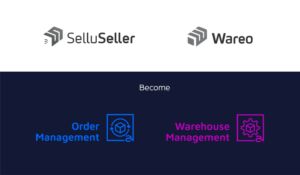
Anchanto had 3 distinguished brands- the company itself and two products with their own identity – SelluSeller (our Order Management System), and Wareo (our Warehouse Management System). As our products are used by hundreds of customers, the brands SelluSeller and Wareo are, in some countries, recognized more than our main brand, Anchanto.
But the reality is that we put a lot of effort into ensuring these two products were designed and engineered following the same principles. They are deeply connected and are in fact, used together by a lot of our customers.
Making Anchanto the hero, and bringing together these two products under it was not only a marketing choice, but it was also a reflection of what they truly are: complementary.
As a result, SelluSeller is now Anchanto Order Management and Wareo is Anchanto Warehouse Management.
These simpler names convey exactly what our products are for.
2. We were building new products
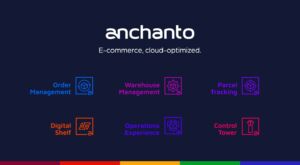
As we introduce our new branding, we also launch 4 new products (and don’t plan on stopping there). This is a giant leap forward for the company and a challenge from a brand perspective. We needed to ensure coherency and build a design modular enough to allow for the addition of new elements. It was also crucial to showcase them perfectly as the building blocks they are designed to be for our customers.
3. We wanted to manifest our enterprise-ready focus
We’ve collaborated with different types of customers over the past years. While we started by focusing on enabling the growth of SMEs, it quickly became apparent that our technology could cater to the needs of much larger organizations. Rapidly, Anchanto’s name was associated with renowned brands such as L’Oréal, Panasonic, and DHL Supply Chain, which trust our products to run their e-commerce and logistics operations.
Businesses shouldn’t have to wait to see our products and meet our teams to be convinced we are the right choice. Our brand should convey this same message from the start.
4. We wanted to showcase our global presence
Anchanto is now a leader in Asia-Pacific. We have expanded rapidly since 2018, opening, on average, 2 new country offices per year. This enabled us to not only work with local businesses but also to support the regional operations of Fortune 500 and other global companies.
And today, we are growing our presence across new regions, near and far.
This global expansion will allow us to build new relationships, new integrations, and enable our customers to explore new markets.
The Scope And Meaning Of Our New Branding Elements
For a fresh look that mirrors the qualities of our business and the value of our products, we’ve revamped the overall face of our company. Let’s take a quick look at what’s new:
1. Our brand colors
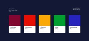
Across our website and company assets, we’ve introduced a new color scheme.
- Our foundation is a deep blue which represents the corporate level we’re striving towards. It also depicts our strength and boldness to capture global markets.
- For our secondary colors, we opted for strong, primary tints. They represent how our products are fundamental components of our customers’ operations.
2. Our shapes and designs
Our products fit together nicely and adapt to the solutions our customers already have. So our customers can opt for as much, or as little Anchanto as they want.
The block shapes that depict our products represent building blocks, a fundamental principle of how we envision their robustness and simplicity.
With the help of these building blocks, our customers can create strong foundations for their daily operations. They pair nicely with other programs allowing our users to replace the systems they want to and keep the ones they like.
3. Our logo
If our customers have something that’s already working for them, our cloud of products doesn’t force them to give those up. They adapt to the customers’ needs and their existing infrastructure.
Our products’ common theme is to have the ability to integrate everything involved in e-commerce operations- starting with marketplaces, webstores, and carriers, all the way to other systems, and we wanted this to be visible in our logo.
The integration concept is perfectly represented by our new Anchanto logo where the “a” and “n” are connected. This connection illustrates our commitment to fast, flexible, and functional integrations across our products.

Our Narrative
Working on the narrative of Anchanto proved to be one of the biggest challenges we would face with this project.
The retail industry evolves fast, very fast. And our messaging and positioning need to stay ahead of the curve, relevant, and aligned with the value we want to offer.
For this, we leveraged our proximity with customers, some of whom are even our investors! Our collaboration with them uncovered the reality of e-commerce and the following realizations:
- All commerce is e-commerce
All transactions happen digitally, sales channel conflicts have disappeared, logistics companies run B2B and B2C operations in parallel, and the list goes on.
- But e-commerce is broken
Today there are hundreds of solution providers vying to support e-commerce and logistics operations. But these individual solutions often don’t work well together, or don’t work at all. This forces businesses to rethink their model, and invest in teams to build and maintain system integrations and workarounds, until an update, or an unforeseen event knocks everything down.
- Until now, until Anchanto
Anchanto was created to fix e-commerce, by integrating everything in your e-commerce operations. Or, if you like a lot of what you’ve got, by integrating our solutions with what’s already working.
Anchanto‘s products are simple. Powerful. And they play nice with all the hard work you’ve already done to create e-commerce solutions that work for you.
What’s Not Changing
A lot about Anchanto has and will change in the coming weeks and months, but some elements will remain the same.
We’re still a company dedicated to providing cutting-edge technology and an enchanting experience for e-commerce multichannel selling and logistics. And we continue to hold ourselves to the highest standards determined by our customers and stakeholders.
Every day our team works tirelessly to ensure that customers’ business operations continue to run seamlessly. We’re incredibly proud of what we do to push the e-commerce industry forward and are thankful for the team members, partners, and clients that have accompanied us in our growth.
We dedicate this rebrand to all of our customers and stakeholders because they deserve a highly refined system and partner to help them excel in their endeavors.
Thanks again to my team and the people at Evviva Brands and SCR Design for their passion and dedication to making this project a success,
Here’s to a new chapter for Anchanto!
Charles Py
